Saturday, February 28, 2015

The DigiScrap Geek Podcast- Episode 21 and Calvinball Prepping


Calvinball begins tomorrow! What exactly is Calvinball you ask? It's a game we are playing throughout the month of March over in the Get It Scrapped forum. We're big fans of Get It Scrapped on the Digiscrap Geek Podcast. It's where many of us learned design principles, how to embrace our style, and most importantly, it's where we all became friends. Frankly, if I had never ventured over to Get It Scrapped, I might never have met my lovely co-hosts and this Podcast might never have happened.

 On the latest episode of the DigiScrapGeek Podcast, we talked with Debbie Hodge, owner and creator of Get It Scrapped. We covered quite a few topics, including Calvinball. I was asked whether or not I would ever go full digi. To hear the answer, you will need to listen to the show!

Meanwhile, I am spending my last hours before March prepping for the Calvinball shenanigans. It's going to be crazy fun. Fellow GIS members and the founders of Calvinball sat down to talk about the games origins on the DigiScrap HQ Podcast. I will be listening to this origin story as I mark photos for printing, rekit supplies and clean up my scrap space this weekend.

Will you be joining us for Calvinball fun? No matter when you decide, it's never to late to join in and change the rules of the game.

Additional Resources


The Get It Scrapped Membership
Click here to visit Get It Scrapped.

Friday, February 27, 2015

My Personal Sketch Challenge

I like to get the most of my supplies  The same can be said of magazines and sketch books.I recently shared my thoughts on using your inspiration as soon as you can. As easy as it is to talk about what you should do, it's not always something we implement. I tried keeping a list of things I wanted to use last year. The list became so long that it was difficult to work with. I ended up throwing it out. This year, I wanted things to be different. I am trying to focus on just one or two aspects of my supplies and inspiration at a time.

One of my goals this month was to use up the sketches in my 2014 planner. Scrapbook and Cards today has a monthly calendar planner which features one Page Maps sketch per month. The appendix also has a few bonus sketches. When I bought the planner, I did so with the intention of using it for my blog planning, figuring I could do the one sketch per month as a bonus. In 2014, I used a sketch from the planner only two times. 2015 rolled around and I got this year's planner. It was now time to throw out 2014, except, I felt like this was a waste. This month, I have been diligently looking through the planner and marking off the sketches.

Might as Well be Cousins by Christy Strickler| Supplies Cardstock: American Crafts; Digital kit: Twitterpations by Traci Reed and Jady Day Studio; Jewel: Studio Calico, based on a Page Maps Sketch


When I make a layout for a design team, I usually strive to make the design one of my own. I rarely use a sketch unless the assignment specifically calls for it. This month, I made an exception. I was determined to use up the sketches whether the layout was for LOAD215 or a DT project. This layout is for Traci Reed Designs. It's a hybrid layout using her latest kit, Twitterpations. As of this layout, I have used up all but six of the monthly and bonus sketches from the planner. I hope to finish the rest of the sketches off within the first few weeks of March. There is also a section for greeting cards. I am considering how I might use the card sketches to design a few of my own Project Life cards. Why not make the most of the planner, right?

There are always going to be a few supplies or bits of inspiration that we overlook. However, if we choose to focus on just one or two things at a time, we can be more successful in using these tools. Take a look at what it is you want to accomplish and choose one or two things to focus on per month. It's more productive and it feels so good to know you made a dent in your supplies or stash of ideas.

Supply Options

Twitterpations by Traci Reed and Jady Day Studio


The Awesome Ladies Project, February Edition


During the last Friday in January, I set aside a little time to work on a creative project. It's one that I started weeks ago, but that I really wanted to finish. Something a bit different from my usual memory keeping. I quilted a set of coasters.

You may have spied a few of these before. I have shared them on social media. I have worked on them off and on, mostly as a a means to keep my hands busy while recording episodes of the DigiScrap Geek Podcast. My hand stitching isn't the best, but luckily the coasters are of a pretty forgiving design. They will look lovely on my living room side table and should see a lot of use.


Tonight, I will be participating once again in the Awesome Ladies Project. I haven't decided what to make yet, but I am looking forward to chatting with the other participants. Perhaps I might just finally start making art journal cards for my Project Life pages.

If you would like to join in on the Awesome Ladies Project, head on over to RuKristin for more information.


Supply Options

The Coaster kit is available at JBS Mercantile while supplies last.

Additional Resources


Check out this episode of the DigiScrap Geek Podcast with Kristin as we discuss telling more of your personal stories.


Thursday, February 26, 2015

Project Life: January 2015

Recently, we shared a bonus episode of the Digiscrap Geek Podcast. We had such a great interview with Jess Forster. In fact, our conversation ran a bit over our allotted podcast time. We decided to include some of that content in a bonus show for you. Hopefully, this will shed a little more light on the subject of pocket page albums. Since we have been talking so much about pocket pages, I thought it would be a good time to share a round up of my January Pages with you.

One of my goals this year is to try to stay on top of my Project Life pages. Joining Traci Reed's team has definitely helped with that. My month has been broken down into a page or two at a time which is more doable for me. I am doing a mix of hybrid and paper pages, several of which I have made tutorials or process videos to accompany.


After documenting my one little word for 2015, I began my album with my traditional New Year's Eve fireworks photos.


I created this layout using a prompt from Simple Scrapper. Essentially, it's a recap of my day. It was a challenging day in which I dealt with kitchen repairs and errands.


I wanted to create a page about common sites in our neighborhood. I have been trying to photograph where I live with a new perspective in mind. I keep asking myself how I can present a common photo in a new way. Using templates is one of the ways I changed how I present my some of those photos. You can see how I created these cards in a recent process video.


This was my final page for February. It's a compilation of the random leftover photos from the month. It includes tv shows and video games we played.


I didn't stick to one kit for the entire month as I had originally planned. Most of the pages I loved and I did find it ok to mix the kits. These pages are mixed in with full size 12x12 pages between some of them which helped me from feeling the mix of kits was too eclectic. I do plan to stick to one kit, or at the least,one color palette for February.We shall see if that makes more of my project life pages appealing to me.

Additional Resources

If you missed the original episode with Jess, you can listen to it by heading over to the DigiScrap Geek Podcast.

I shared my thoughts about pocket page scrapbooking in this blog post.

My 2013 Project Life Pages

My 2014 Project Life pages


Wednesday, February 25, 2015

Game On! A Winter Lift me Up

Many people know there are scrapbook challenges to inspire us, but did you know there were games too? I recently participated in one of my favorites. Americans will recognize that this game is based off of Telephone. Some of my friends from UK may recognize it as Chinese Whispers. Essentially, you start off with one layout. The next person must scraplift it then pass her page onward. And then the next person scraplifts that page and, well, you get the picture. No one reveals their layout until the end of the game. When everyone has finished their pages,the hostess puts the layouts in order so that we can all view the progression of change that occurs in the design. The bigger the group of participants, the more likely the last layout may look drastically different than the first.

I thought I would share my take on the challenges. If you would like to see all of the layouts in full progression, check out this post from Cocoa Daisy.

Baby Boo by Christy Strickler | Supplies Patterned Paper, Die Cuts: Basic Grey; Letters: American Crafts; Buttons:Maya Road; Glitter Dots: DoCrafts; Other: Ribbon, Cardstock


Since I was playing a game at Cocoa Daisy, I chose to work with my January kit. I am still loving it, though not much is left. This is my 7th layout from that kit! Despite the fact that the kit is packed with supplies, I have really been working hard to extend it as far as possible.

I am looking forward to playing more scrapbook games. They are a fun way to use your stash of supplies and connect with other memory keepers. Currently, I am gearing up to play Calvinball over at Get It Scrapped. The game starts on March 1st. If you are curious about playing and want some preparation tips, pop over to the Calvinball forum at Get It Scrapped.

Supply Options
All of the supplies are from the January Cocoa Daisy Kit.


View blog post for supplies


Tuesday, February 24, 2015

Get It Scrapped: Kitsch Style


The kitsch style tends to be known as garish. It's bold in it's own right while, in many ways, it exudes a feminine grace. Somehow, all of this bold design comes together and it works. It's the perfect style to describe someone with a bold personality. I chose to document our female cat, Jujubee.

A Diva Still by Christy Strickler |Supplies Patterned Paper: Sassafrass; Die Cuts: Sassafrass, Glitz Designs; Letters: Pink Paislee, American Crafts; Stickers: Webster's Pages; Ink: Tsukineko; Other: Doily, Buttons, Sequin Trim; Appears in an article for Get It Scrapped


Kitsch isn't my normal style. It took me some time to study it and get a feel for how it worked.I explored Pinterest for awhile, making notes of color, pattern and design. There is a definite retro feel which led me to choosing a collection of paper with that in mind. I also felt that, in order to make it work, I must use variations of the same colors throughout. Color and design of the layout made the page cohesive. 

The first print I chose is the diamond pattern in the canvas. I was then able to add scraps of paper and die cuts which repeated those colors. I knew I wanted a cat on the page. The queen die cut was chosen as I shuffled through my supplies. Not only does she repeat some of the colors from the canvas, she also represents that my cat is female and loves the world to be focused on her.

As I clustered the die cuts and embellishments around the photo, I paid attention to motif and color. My aim was to draw the eye to the photo and the queen. Notice how I repeated some motifs such as the flowers and the doilies. To add a bit more garishness to the page, I chose to mix in both silver and gold elements.

I am not sure the kitsch style is one I would use on a regular basis. However,experimenting with it was still a good creative exercise. I needed to identify what makes the style work so that I could incorporate it into my own page. Understanding a variety of styles can really help you to identify more strongly with your own personal style. It also helps you to touch base with some of the basic tenants of design. Once I had identified the components of kitsch style that I wanted to work with, I was able to choose a solid page design which would allow for my own personal style to be present in the page.


Additional Resources


The Get It Scrapped Membership  
Click here to view more details


Monday, February 23, 2015

Scrapbook Challenges: In the Sink?

It's Monday which means it's time for another awesome sketch from Scrapbook Challenges. I still seem to be working through a lot of cat photos. Today's page features some photos taken in a series. Sketch #429 is the perfect sketch for them, allowing each photo to appear in an easy to view order.

In the Sink? by Christy Strickler |Supplies Patterned Paper: Cocoa Daisy, Crate Paper; Letters: Chickanidy, American Crafts; Pen: Securit Chalk Marker, Sharpie; Stickers" Evalicious; Punch: Martha Stewart; Stamp: Cocoa Daisy; Ink" Tsukineko; Other: Glass Beads, Sequins, Doilies; Based on Scrapbook Challenges Sketch #429 


I started with a photo of my cat sleeping in the sink. The two photos that follow show him turning to look at me as I shot the photo. Even though they are not all horizontal photos, I made it work with the sketch. To accommodate the title, I shifted it slightly to the left of the vertical picture.For the most part, this page follows the sketch to a T. However, I felt a bit uncomfortable with the amount of weight the vertical photo added to the right side of the page. To shift things back into balance, I added a scattering of punched circles and some doilies to the left side. I did carry the punched circles throughout the layout in a sort of diagonal flow. However, to keep the weight balanced, I created a more concentrated placement of the punched circles on the upper left corner.

Be sure to head over to Scrapbook Challenges to see more inspiration from the SBC Sketch Crew. If you create a page using sketch#429, please be sure to link up. We'd love to see your work.


Supply Options

Most of the supplies came from the February Cocoa Daisy kit.


Saturday, February 21, 2015

LOAD215: Progress Report 2

I had meant to do a weekly report, but I have been quite busy. So far so good. As of right now, I am down a couple of layouts for the daily pages. However, I have been making quite a few pages for various design teams. My total pages this month so far: 31 layouts( a mix of pocket and traditional pages) plus one mixed media project for Deflecto. Despite not posting a couple of pages to the LOAD215 group, I am feeling pretty good about what has been accomplished so far. Here are a few of the pages I have not yet shared from my layout a day experience.

I had challenged myself to create  pages based on sketches I had been collecting. For the most part, I have stayed true to my word. In many cases, I have even been using sketches for some of my design team projects. This page was an exception to that challenge. I chose to create a page using a planner ad which meant I had to work around the parts of that ad. 


I seem to be on a big kitten kick this month. I realized that I had yet to document bring Boo home. The photos are from 2009. I have really been enjoying taking a look back at such a happy time in our lives.


I seem to also be on a kick with my January Cocoa Daisy kit. This is one of six layouts that I have made with that kit.


I have also enjoyed reaching for some of my older supplies. In their own way, supplies tell a story about our memory keeping experience. I pulled out a few of my last remaining Sassafrass flowers for this page. I was so sad when Sassafrass left the Scrapbook supply business.


Another goal of mine this month was to mix old supplies with new. I found these older leather purse die cuts from American Crafts in my stash. While I like the gem motif that has been appearing lately, I wasn't finding it easy to use. Mixing it with the purses and this particular photos was a good choice for me.


As you can see, I am not really following along well with the book related prompts. After seeing those kitten photos, I was on a mission to get them scrapped. I have made a few other pages with older photos I have come across. Overall I am enjoying my layout a day experience. There are a few days I have felt a bit tired out and I think being busy has also played a major role in my decision to go off prompt. I want to scrap and tell stories but I don't want to think too deeply about creating pages .


Friday, February 20, 2015

Tales of a Craft Class Junkie: Design with Single and Pretty

One of the classes I never fail to finish each month is the Masterful Scrapbook Design series from Get It Scrapped. The most recent class is called Single and Pretty. It's focus is the design of scrapbook layouts centered around one photo. To be honest, the word "class" kind of falls short of describing the material. Design is not just discussed. There is also a accompanying Scrapbook Coach. This is essentially a video that walks you through the steps to making a layout centered around a particular design concept. It's like scrapbooking alongside a mentor. I put the Single and Pretty Scrapbook Coach and templates from the membership section to work this month while creating layouts with some of Traci Reed's latest kits.

Rise and Shine-Not By Christy Strickler |Supplies Cardstock: American Crafts; Digital Kit: Rise and Shine by Traci Reed and Amber Shaw; Other: Glossy Accents; Based on a template from the Get It Scrapped Membership


What I have always loved about Get It Scrapped is that it guides me along while still allowing me to do my own creative thing. This page started with a 8 1/2 x 11 template.I don't typically scrap smaller layouts as I prefer 12x12 albums. I liked stepping out of my comfort zone and practicing design on a different scale from what I am used to working with. On the occasions that I scrap on a smaller canvas, I live to mount the page to a 12x12 piece of paper so that I can easily fit it in my album.This time, I wanted to do more with it then just to stick it down on  paper. I chose to add a stitched grid to the canvas.

There Is a Story in Her Eyes by Christy Strickler |Supplies Cardstock: American Crafts; Digital Kit: She Is by Traci Reed; Other: Buttons; Based on a sketch from the Get It Scrapped Membership


The block design is my typical go to style of page. However, the more I work with Scrapbook Coach, the more I find myself extending the types of designs I typically work with. I am really starting to love having 2-3 clusters on my layouts. Though this page is based on a sketch, working with it helps me to subconsciously incorporate it into my repertoire. The more I practice, the easier it get to create with a wider variety of designs.

I am no stranger to documenting a story with just one photo. However, after completing the Single and Pretty class along with the accompanying Scrapbook Coach I find myself stepping outside my typical layout style. Once again, I am growing and developing.

Supply Options


Rise and Shine by Traci Reed and Amber Shaw


She Is by Traci Reed


Additional Resources


An article from the Get It Scrapped Blog


The Get It Scrapped Membership


Wednesday, February 18, 2015

Scrapbook Challenges: February Mood Board

Today, there is another fabulous mood board up at Scrapbook Challenges. Since Valentine's day is in February, one can expect a bit of pink in the color palette.I don't dislike pink. I often slip little bits of it here or there on a layout. Predominantly pink is another thing. I just usually don't use that much. This layout though was going to have a lot of pink.

Max and Boo by Christy Strickler |Supplies Cardstock: Bazzill; Digital Paper and Elements: Pixels and Co. February 2015 Subscriptiont kit-Loverly; Letters: My Little Shoebox; Wood Veneer: Studio Calico; Ink: Versamark; Enamel: Freckled Fawn, My Mind's Eye; Other: Tape, Doily; Based on a Page Maps Sketch


I knew there would be a lot of pink because I chose the dachshund paper to accompany the photos of my dog meeting one of our kittens. I know a lot of people associate pink with girl's pages. It may surprise you that none of the subjects in my photos are girls. I have no issues with using any color of my choosing on a page. I don't let gender dictate any rules. However, there is only so much pink that I can handle. I chose to make the design feel a little more graphic by using an orange canvas and matting many of the paper on black cardstock. Pink is soft. The orange and black add energy. To make the design feel more cohesive, I made sure to pull the orange upward into the title and some of the embellishments.

To see this month's mood board, hop on over to Scrapbook Challenges. Don't forget to link up any projects you make!

Supply Options


Pixels and Company February Subscription kit


View blog post for supplies


Get It Scrapped: Using the Compositional Story Style


This story style is not really the norm for me. However, the challenge to use a compositional story style really had me thinking out of the box. How many times are there a set of photos that need a little extra context? As I look through my son's homeschooling photos, I realize that many of them could use a little extra support to add more context and meaning. Today's layout is an example of that.

Earthquake by Christy Strickler |Supplies Patterned Paper: Studio Calico, My Mind's Eye; Letters: Jenni Bowlin; Tape: My Mind's Eye; Vellum: Studio Calico; Acrylic: Cocoa Daisy;appears in an article for Get It Scrapped


If you look at these photos by themselves, you probably would have no clue what my son is doing. I remember doing this project with him, but really, the photos are a bit bland and there isn't much in them to help tell the tale. I chose to create a layout which would support the photos by filling in the blanks. 


I picked the background paper first. It is filled with light blue lines. The color makes it a perfect substitute for the sky. However that's not the main reason I chose it. The pattern of the lines reminds me of a seismograph. Choosing the background was the hardest part. The earth portion was easy. I wanted a brown colored chevron print to convey the energy within the earth during a seismic episode. Ripping the paper in two and adding the scene with the houses makes the story of this page pretty clear.

The compositional story style will work for many types of photos. As I created this layout, I realized that photos without a lot of evident story can benefit. It's a style that definitely sets the scene for any layout. If you give it a try, we'd love to see it. Share your layouts with us in the Get It Scrapped Gallery.


Additional Resources


The Get It Scrapped Membership
Click here to view more details


Monday, February 16, 2015

Scrapbook Challenges: Talk to Me

If there is just one good thing about Mondays, I think it has to be that there is a new sketch over at Scrapbook Challenges. I especially liked this sketch. It called for the use of two 3x4 cards. It was an excellent opportunity for me to dig into my PL stash.

Talk to Me by Christy Strickler |Supplies Patterned Paper: Studio Calico, Bella Blvd.; Letters: Basic Grey,Mambi;Cards: Beck Higgins; Tape: Glitz Designs; Wood Veneer: Studio Calico, Crate Paper; Acrylic: Studio Calico; Stickers: Twine and Ink; Inspired by Scrapbook Challenges Sketch #428


For the most part, I followed the sketch. I added a thicker border to accommodate the large letter stickers. I also changed the orientation of the sketch from the right side of the page to the left. I did so because I didn't want my son to be looking off the side of the page. Now he faces the title block.

I kept the embellishing fairly simple. Though I don't mind objects overlapping, I wanted to maintain the segregated patterned paper blocks. To make the title more interesting, I added chipboard to some of the letters. It added dimensions while allowing me to slip some of the letters more easily under one another.

We hope you will play along with the sketch. To see it and the rest of the Sketch Crew inspiration, head on over to Scrapbook Challenges.

Supply Options

View blog post for supplies


Sunday, February 15, 2015

My February Planner


True to my prediction, I am not doing a whole lot of  decorating in the calendar pages of my planner.I am using it effectively though. I filled portions of my January calendar pages with events that happened throughout the month. I tried adding things my husband or son said. I included video games we are playing and what we are watching on tv. I shared triumphs and challenges from our daily school life. My planner has also become a place to house memorabilia or to include specific pocket cards I want to include in each month's spread. Since I sometimes jump around in different month's to document my pocket pages, having everything in one spot may just help keep me from missing certain stories and details. I think I finally found a method that works for me!

I did enjoy decorating the cover tab for the month. Once again, I kept it simple and without much dimension.I used a doily, a punched circle and some items fussy cut from a journaling card. It may not be fancy, but it works for me.

Additional Resources


Saturday, February 14, 2015

Happy Valentine's Day!

It would seem I have been taking a time looking back at older layouts. I really love looking at groups of layouts as a whole. Since today is Valentine's Day, I thought I would share a few of my past Valentine's Day layouts.

I made this layout back in 2013. Though the page features my son, this layout is also about the special treats my grandmother gave me for Valentine's Day when I was a child.


I created this layout about my son's first Valentine's party. There are a  few hearts, but really, I didn't use any Valentine's themed products. Instead, my focus was creating a scene with woodland animals.


Unlike the page above, I did use a Valentine to create this layout. Technically, this isn't a page made for Valentine's day. I just love that cat valentine printable though.


This layout is all about my son making Valentine's day crafts. 


I am looking forward to documenting this year's Valentine's day. We have a little something special for my son. I am hoping to create the layout pretty soon. I just need to edit the photos and pick the supplies.

Happy Valentine's Day everyone!


Friday, February 13, 2015

The DigiScrap Geek Podcast, Episode 20: True Confessions of the Pocket Scrapbooking Kind.


I have a love/ hate relationship with pocket style scrapbooking. There are times when it comes easy for me and I love the pages. Other times, I find myself unhappy with the results. I don't necessarily hate the pages but there is just something that feels a bit off. In the latest episode of the DigiScrap Geek Podcast, we sat down with Jess Forester to talk about the different approaches to pocket scrapbooking. It was a conversation that has helped me see pocket page scrapbooking in a new light.

Prior to the show, Summer and I started talking about our pocket style layouts. We discussed what we were liking and not liking. We took a look at a few of each other's pages, trying to get a feel for what we thought might be that missing element that would make us love our work. We brought this up on the podcast, as well. I thought I might share a few pages and show you what I think is the reason between what makes me ok with a page and what makes me love a page.

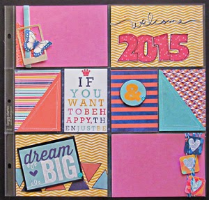
The cover page for my November 2013 pages is a definite favorite. I made my own filler cards with ease and found ways to add parts of my November story to two of the cards despite not having photos.


My wedding anniversary is in November. Creating a layout about our day might have proved difficult. I had a lot of photos. I choe to document our day over three project life pages. I sorted the photos into groups and kept them together to tell a story for each aspect of the day.


Reasons why I think I liked these pages:
-The photos and stories are in a placement that makes sense to me.
- There are filler cards but not a bunch of them.
-I used many items from the same scrapbook kit. Everything feels well coordinated.

I didn't complete all of my November pages right away. I came back to them a few months later. I printed and placed the nature photos in 4x6 pockets. I ended up needing to stretch the photos over two pages to fill in the missing sections from my work with the previous layouts. Though all of the nature photos were together, it felt like something was missing from the page.


Reasons why I don't love this Page:
- Not much embellishing
-despite using color coordinated items, the page somehow feels off
- I am not sure I like the giant filler card
- I kind of miss having more of a mix of large and small photos
-Feels like I just threw stuff onto the page without much thought.

I know I need more practice making pocket pages. I don't plan to trash the ones I don't love. I simply need to make more observations about what works for me and what doesn't. Design aesthetics are almost always a very personal preference. Doing the mini critique with summer and talking about our pages with Jess on the podcast has helped me have a new perspective of my pocket pages. Planning a pocket page in detail still doesn't come very easily for me. However, now that I have sat down and analyzed my process I think I can move forward with more focus.

To listen to this episode of the DigiScrap Geek Podcast, click here.

Additional Resources

You can find  my November, 2013 pages at the following blog posts:

Project Life and Gratitude
Friends Who Scrap Fall Inspiration Blog Hop
Project Life and Gratitude, Part 2


Thursday, February 12, 2015

Scrapbook Challenges: February Pattern Challenge

The latest prompt at Scrapbook challenges involves a mix of Doodled Patterns. One could get caught up with trying to find a close match to each of the patterns. Instead, I chose to take away one or two things from each suggested pattern before curating my supplies for this layout.

Best Pals by Christy Strickler |Supplies Patterned Paper: Bella Blvd.,Studio Calico, Gossamer Blue, Heidi Swapp, Echo Park;Letters: American Crafts; Tape: Freckled Fawn; Enamel Stickers: Freckled Fawn, My Mind's Eye; Chipboard: American Crafts; Stamp: Blinks of Life; Ink: Staz-on; Punches: Fiskars; Die Cut: Traci Reed Designs;Other: Glossy Accents; Based on a PageMaps Sketch


It just so happened that I had a similar piece of paper to the one shown in the inspiration photo.The only difference was that mine was turquoise. That piece set the stage for my color choices.Since the canvas had a lot of doodling and was very busy, it was important to have a text paper with a single word as the focus. I didn't have a multicolored piece of paper that said hello. I did have one in black and white. Given that the canvas was turquoise, the switch was a good idea. If I had not had this piece of paper, I could easily have recreated something similar with some of my stamps. I was also lucky to have a sheet of paper with gems on it. A more organic print with hearts would have worked equally as well.

The gem motif seemed to be quite the sticking point for me. I am not one to wear a lot of jewelry, so I knew I would not take the motif literally. Instead, I focused on concepts such as love and friendship being a treasure. This led to my choice of photos and inspired my journaling a bit. Notice the small handwritten pennant on the lower right. " A true friend is a gem." Even if you don;t have some of the paper patterns shown in the challenge, think about what motif they are trying to convey. Can you bring that motif into your layout somehow. Perhaps you can even consider a quote or phrase which would become the starting point of your layout.

Don't forget to stop by Scrapbook Challenges to view the February Pattern choices and design team inspiration. We'd love to have you link up your layout with us at Scrapbook Challenges.

Supply Options
You can find gemstone stamps at Blinks of Life. ( I am not an affiliate but love their stamps.)

Pocket Life January Stickers by Traci Reed


View blog post for supplies