Friday, December 23, 2011

A White Christmas- My Version

 I live in a warm climate. So, technically speaking, there is not white Christmas here. We have palm trees, cooler sea breezes, and holiday lights. I have only seen snow a handful of times in my life. It's a beautiful thing, but something I am glad I don't have to deal with every year. So, where's the white Christmas? It's hidden in the photos and memories I have recently scrapped of a trip to Colorado. It's the magic of tiny snowmen, the falling snowflakes, and crunch of the snow under your feet.
   One of the most magical things I have ever done with my son is to build this little snowman.
Pencillines sketch #262
OA papers, recollections snowflake stickers, ATD title sticker, glass beads, glossy accents, Jolee's felt snowman, Crate paper sticker, Kaleidoscope slide with transparency by magic scraps,glimmer mist in silver sugar, viva pink and electric blue
He was the tiniest of snowmen. At 6 inches tall, he was largest snowman that my son and I had ever built. I think we shall always remember him. Building him was not just a first for my son, it was a first for me.
  The magic of falling snow may sometimes be lost on people who deal with it on a regular basis. For us, though, even the tiniest of flakes was the most amazing and wonderful thing.
Unknown papers, doodlebug snowflake brads(?),Inkadinkadoo stamp with colorbox lagoon ink,Martha Stewart snowflake punch,waterfall stickles, sequins, glass beads, i-roc jewels, unknown vellum flocked with white snowflakes,unknown quote,glimmer mist in frost,moonlight and electric blue
title block received in a swap
lifted from a page called "June Faves" by Lynette Pancho

To mimic the look of the snow, I added some bits of leftover punched bits. The bits were from a sparkly Bazzil cardstock. So when I sprinkled it over the glue, some turned up on the matte side while others were sparkly.It added a nice bit of texture.
   Of course, after admiring the beauty and wonder of the falling snowflakes, children will then wonder about catching them on their tongues. I guess nothing tastes as sweet as a falling snowflake.
 Unknown papers( one of which is a vellum with white flocked snowflakes), martha Stewart snowflake punch, i-rock jewels, unknown snowflake button, glass beads, glossy accents,Karen Foster alphas outlined with an oceanview blue bic mark it,inkadinkadoo stamp with colorbox lagoon ink. Based on an Lo by Dina Wakely called "oh Fun."
Though I may not have the option for a white Christmas, making these pages sure got me into the holiday spirit. I hope your family enjoys the holidays and has a wonderful New year ahead of them!

Monday, December 12, 2011

A Tone on Tone Background

  I've been eyeing border punched backgrounds for awhile. Tone on Tone punched backgrounds always seem to make quite a statement. So when I saw the current pagerize this challenge at Scrap Our Stash, I felt the punched background would be a nice substitute for the stamped and painted background of La Vikinga's page.
Since this was a page for my wedding album, I chose to use some of Bazzil's pearlized cardstock. I only own three border punches and only one seemed to be appropriate for my wedding theme. This meant that  I had to get a little creative. I hand cut scallop borders from one inch strips. I then layered the leftovers from the punched edges and the hand cut borders in alternating patterns. Doing this made it seem as though I had more border patterns then I really did.
Pagerize this challenge#16-Scrap our Stash
Bazzill Cardstock
Apron Lace border punch- Martha Stewart
Bazzill paper flowers-white
other flowers-Prima
K and Co. brad
Webster's pages trims and lace
Little Yellow Bicycle hat pins with glass beads
Pink Paislee rhinestone button
Webster's pages sparkler's buttons
  I added an additional photo to the design and substituted flowers and embellishments for the title. I did not feel the page needed a title since it will be in the middle of my wedding album. I am happy to say that the lace I used was a scrap piece. There was just enough to make a second page with the same design.


I managed to use up the last of my Webster's pages sparkler buttons and several packages of flowers. I can say that I am happy to have used so much of my stash and I now have two more pages complete in my wedding album.

Now it's your turn!Head on over to Scrap our Stash so you can pagerize this!

Cookies For Santa

No...we did not bake them this year. At least not yet. I just finally got around to scrapping about last year's cookies. LOL. Nothing like being a bit behind, right? Months ago, I scrapped the photos of my son baking said cookies. As I was flipping through last December's album, I thought now might be a good time to use the scraps up. I must say, that when I saw that the Sketchy Thursday sketch really helped this page come together quickly.
Sketchy Thursday 12-8-11 sketch
Little Yellow Bicycle canvas border
Basic grey papers
Sassafrass alphas with glossy accents and glass beads
glimmer mist in Candy apple red and meadow
October afternoon stickers
I-rock gems
K and Co. brad
coffee filter
Perhaps soon, I shall get to baking this years cookies. Those photos sure make me hungry for some!

Friday, December 9, 2011

Scrap Our Stash Frugal Friday tip- buttons from packaging


We are all attracted to it in some way or another. Sometimes, it's part of what inspires us to make the purchase. Companies pay top dollar to design it. What am I talking about? Packaging, of course! Sometimes, I am loathe to throw it out. There has to be some way to use it.  Today, I am going to invite you to get out some of your punches the next time you open a new scrappy supply.
  Recently, I acquired a Martha Stewart embossing button punch. I have been searching high and low for things to punch( other than patterned papers) to make buttons with. I also happen to have a very messy drawer full of recycled items I hope to use in the near future. The problem with the messy drawer is that I hate to open it and look at the mess. Thus, I rarely use anything out of it. I merely pop it open as fast as I can to shove something else in. So I resolved to actually use some of that mess. I figured that if the item became an embellishment( as I had intended it too) than I might be more apt to reach for it the next time I was scrapping. Armed with my button punch, I opened the drawer and pulled out some package bits.


   In November, I had acquired the Melody Ross chip art tool. I set aside the clear packaging portion to make ghost letters and homemade acrylic style shapes. The backing is a nice thick piece of chipboard. From it, I cut the bracket shapes outlined in yellow. These will be filed into my journal spots box. I can use them as is with the quotes intact or I can paint or cover the quotes to adapt them to some future page.
  Now to punch some buttons from what's left. Parts of the packaging had lovely wooden patterns on it. That's where the buttons on the left came from. Other parts had flowers, birds and butterflies. Those would make some lovely buttons! However, the chipboard is too thick for my punch. So, I decided to peel away the chipboard layers. To loosen the layers, I took my paper piercer to a corner and separated the edges.

Once the corner is started, you can carefully peel away the layers. I did my best to peel it in half. This made thinner chipboard which my punch could handle and also allowed me to punch images from the front and back of the package.
Try to plan out where you want to punch. I cut away the unwanted  parts of the back which had wording and the sku number. This made it easier to punch the parts of the image I wanted.
As you can see, these made some nice embellishments. If you don't have a button punch, try using one of your own favourite punches.

Wednesday, December 7, 2011

Twelve Tags- Day 5

  Mine is not really a tag at all. As i have for the other days, Day 5 is an improvisation using what I have on hand. Some of you know that I am a mystery box addict. One of the things I get in the Maya Road mystery boxes are acrylic shapes and mini albums. I am not one to make mini albums, but I do love to take them apart. I find I can use them directly on a 12x12 scrapbook page. So with that in mind, I chose some acrylic mini albums pages to play with.
ranger alcohol inks in expresso, latte and caramel
Th inking tool
Maya road Acrylic house
In addition to the house, I also chose a butterfly and a small paisley. As Tim suggested, you could also use product packaging.
  I started by covering the acrylic shape with the ink.

The house was my first attempt. I made the mistake of not letting it dry all of the way before I stamped on it. I did however, get the gist of what I was supposed to do and got a decent looking effect.I also did not have an archival ink. I used a dark brown pigment ink instead.

After the partial success of the first shape, I was keen to try more. My next attempt was a butterfly and a paisley. I also chose more appealing ink colours. I am now questioning the wisdom of purchasing brown inks. This time, I chose eggplant and stream colour inks.


As you can see from the closeup, the effect is subtle but stunning. The key to getting the image to come off is to one, let it dry well before stamping and two, blot gently with a dry tissue or paper towel.


I now have added more alcohol inks to my wish list. I am really glad I tried this out.I think it's going to add a lot to my pages, as far as texture and dimension. Keep your eyes peeled...this butterfly just might pop up on a layout soon.

Tuesday, December 6, 2011

Twelve Tags of Christmas- Day 4

 As much as I liked the tag from Day 3, I decided to skip it...at least for now. The interesting techniques for the day 4 tag were beckoning. As usual, I lacked many of the supplies Tim used for his tag. What I did have was an embossing folder with the snowman. So I pulled out a thin piece of chipboard...the kind you can get from the top of a scrapbook paper pad. It was just the right thickness to emboss while at the same time thin enough so that I could cut out parts of the center. After embossing the chipboard, I cut the snowman out and carefully extracted the snowflakes with an exacto knife.
Once the cutting was complete, I applied a thin coat of white acrylic paint.After the paint dried, I added the rock candy crackle glaze.
While I waited for the glaze to dry and crack to perfection, I made the background sheet. I used a plain sheet of kraft paper as my base. Since I do not have all of the inks Tim used, I chose to stamp my blue ink pad onto wax paper. I stamped a square about the same size as the base paper. I then added a little bit of my homemade white mist. The white mist consists of watered down acrylic paint with a bit of perfect pearls powder.
Swirling the cardstock around on the wax paper created a wonderful sort of mottled effect. I set it aside to allow it time to dry. Now it was time to move back to the snowman. Once again, I did not have the inks Tim used. This time, I substituted glimmer mist. I opend the bottle and dabbed the dropper onto various sections of the snowman. I was pleased at how the mist seeped into the cracks. I applied the heat tool as Tim suggested and saw the white of the base coat become more apparent while the cracks kept the colour I had infused them with. I later noticed some of the glaze falling off.I am not sure why. Maybe it was the materials I used. To combat this, I applied a thin coat of glossy accents over the whole snowman.

Tim Holtz Embossing folder, Gauze from a first aide kit.glossy accents,
Ranger rock candy crackle glaze, Martha Stewart snowflake punch
clear packaging, Basic Grey Flourish stamp,
Technique Tuesday snowflake stamps
Colorbox ink in white and Blue Lagoon
Glimmer mist in electric blue, frost and spring violet
I raided the first aid kit for some gauze which I cut down and tied into a scarf. Thin clear packaging was punched into snowflake shapes. I am very pleased with the results. Most of all though, I am pleased with the new technique I learned for creating a unique background.

The Silly Rabbit

Yes, I know it may seem odd to scrap an Easter page during December. However, the photo wwas really begging me to scrap it. I was keeping current pretty well up until a few months ago. Now I am woefully behind. Aren't we all though!?!? Anyway, here's a little something spring during the cold months of winter. We had taken my son to an Easter carnival earlier this year.  When I saw the rabbit walking around, I knew I wanted a photo of my son with him. My son obliged and the rabbit added a little silliness to the whole thing which equaled the perfect photo!
Sketchy Thursday 12-1-11 sketch- Cosmo cricket papers-floral and bunnies, polka dot paper-sassafrass, sassafrass flowers, cosmo cricket border sticker, Sassafrass chipboard, pink paislee button, DMC floss, MM ribbon, American crafts rub on letters, Webster's pages alph stickers with glossy accents, glimmer mist in Electric blue and viva pink
update: on 12-8-11, this page was chosen as a Sketchy Thursday Fave! I am so excited. This is the first time I have been picked!

Sunday, December 4, 2011

Becoming Mr. And Mrs.

    Every once in a while, it's good to follow the step by step instructions in the making of a layout. Why? It introduces you to a new technique without the stress and guesswork of what to do with the rest of the page. During November, I took a free class at Miss Arts Paper Crafting School. The class led me through a series of steps to add texture and dimension to my page. It was an enjoyable experience and led to the creation of a page that, while not my usual style, is truly wonderful.
   I did not have all of the materials suggested to complete the Layered Layouts class. Rather than purchase the supplies, I made a kit, attempting to match the supply list as much as I could from my stash. By doing so, the page became unique to me, despite the fact that I was following a series of step by step instructions.
Gesso
Pink Paislee glitter alphas
Glimmer mist in frost
Basic Grey paper clip
Tim Holtz metal tags
I-rock jewels
Basic Grey Wisteria paper
Making Memories shimmer flourishes-blue
My Mind's eye papers
Maya Road lace trim
Carboard
gauze from my first aide kit
Jenni Bowlin stick pins
Webster's Pages button sparkler
Maya Mist in Latte Metallic

 Though I may not use everything I learned in the making of this page, I will take parts of the process to incorporate into future pages.
  By completing the step by step instructions, I was able to learn the how and the why behind the page's design.I also learned that I love altering pre-made embellishments to meet my needs. I have always loved metal embellishments, for example, but never really liked the way they looked on many of my pages.They seemed to dominate aspects of the page. By altering them, I was able to give them a one-of-a-kind look and better able to blend them into my page's overall design.


The metal tags  have so much more character. I even think it's easier to read them now.
  This page will become the title page of my wedding album. Though it might not be my usual style, it's very special to me, both because of the amount of work I put into it and because of the end result.

Now it's your turn! Scrap Our Stash is celebrating it's birthday! Share a page or project you've made to help celebrate two wonderful years of using your stash in new ways!


Saturday, December 3, 2011

The Twelve Tags of Christmas-Day 2

The tag for day two was simpler than day one. I think it's a good thing as it took me two days to make the first tag! LOL Once again, I did not have many of the materials, so I improvised.
Materials: Tim Holtz metal charm
Colorbox gold ink and Chestnut roan ink,
making memories snaps
Pink Paislee trim, twine, Bazzil cardstock
Holly  from K and Co. paper
diamond stickler

I used a printed kraft paper from the Paper Studio. To get the same effect as having the resist paper, I stamped the word Christmas with rusty pickle alphas and clear embossing powder. After I heat set the powder, I rubbed white acrylic paint across the paper. I quickly wiped it down to reveal the word. The holly was fussy cut from the k and co.paper. I hand cut the border on the bottom from chipboard. Inking it in cold achieved a nice, metal like appearance.
    I really liked how Tim had the indentations in his brads. I chose to use snaps. I did not attach them to the chipboard right away.Instead, I crimped the back of the snaps in my crop-o-dile. to do this, place the snap in the crop-o-dile without any paper. Then punch down. The result is a somewhat flattened back to the snap.

I then flipped the snap over and used the bump in the crop-o-dile to add the dent. Once I had five done, I used glossy accents to adhere them to the page. It's so much easier than trying to set the snap directly into the paper.
  I drew the dear by hand, then carefully cut it out. I inked the edges with the chestnut roan, then carefully edged it with Diamond stickles. My son says he likes it better than the day one tag! No kidding! LOL and this one was so much less work for me! Sometimes, simple really is best I guess!

Friday, December 2, 2011

The Twelve Tags of Christmas-day 1

   Last year, I was introduced to the Twelve Tags of Christmas event on Tim Holtz' Blog. While I did not participate, I did learn a thing or two. This year, I decided to try some of the tags myself. I must admit, that while I do like a lot of Tim Holtz' products, I do not own very many of them. Perhaps, at some point in the future, I will be able to acquire more.Meanwhile, I made due with the stash I had on hand.I decided to share some of what I did here along with my version of the tag...which is a bit more like a title block.
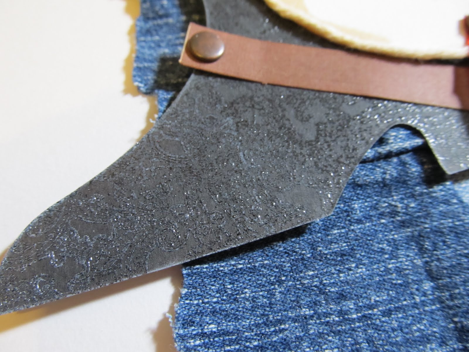
  First of all let me say that I do not have the same tag Tim used. Indeed, I do not even know the size measurements of said tag. I chose to use a piece of cardstock 4 1/4 inches x 4 inches. There is no special reason the tag is this size other than that, I decided to draw the title by hand to mimic the" Noel" used on Tim's tag. In doing so, My not so awesome skills of drawing meant the title was a certain size. So I had to make the cardstock base in an appropriate size to match the title and hold all of the elements. So yes, if you just did a double take, I did say that I hand drew the title. I pulled out a piece of grungeboard and did my very best to make my "Noel" look like Tim's.It need not be awesome or perfect for it will be covered with glitter. Glitter and paint can hide a lot of mess from erasing.
After drawing the title, I carefully cut it out using an exacto knife. Try to do it in small stretches, cutting small bits out at a time. Also, don't stress if you accidentally rip bits off, which happened to me. Remember, Paint and glitter can hide a lot of things.

Look carefully and you will see that the top of the N is missing part of what I drew. Also, the flourish under the L lost some of it's tip. Just to review, after I cut this, I then decided on the size Cardstock that I would use as a base.
  The first thing to really catch my eye were the paper pine cones. I wanted to make one so badly! Not having the die, I mulled over a few ideas.The following is what worked best for me.
materials for paper pinecone: scallop border, toothpick, adhesive like hot glue or glossy accents
White paint, brush and stickles( I used icicle.)
I took the guard off of my corner rounder and punched a scallop border. Small scallops seem to work best for this, since I wanted a small pine cone. You could even draw your own border, for the scallops need not be perfect. I initially cut a 12 inch long border. For the small pine cones on this project, I found that I only needed half of it to make one. Once the Scallop border was punched, I rolled and bent the edges a bit. You will do a bit more of this later when the pine cone is completely made,but doing this a little now is a huge help for later.

Next, I adhered a toothpick to the edge of the border. Note that I cut off the pointy end. That way, it does not show on the finished pine cone. After the glue is dry, cut slits at the intersection of each "v" in the border.
Be very careful not to cut all the way through the border strip. Cutting the slits helped me bend and shape the pine cone since the card stock I used was a heavy weight.Now, roll the border onto the toothpick in the same fashion that Tim demonstrated. When you come to the end, adhere the tip of the border. Once dry, begin shaping your pine cone. I found that my paper piercer helped me pull open the pine cone. Just be gentle so you do not tear it. Once that's done, dry brush some white paint on the tips of the pine cone. Then add smear some stickles on with your finger. Repeat to make the second pine cone.

   Honestly, I wasn't really liking my pine cone a whole lot at first. Adding the paint and the stickles is really what gave it that pine cone look.
  For the greenery, I hand drew various leaves in an attempt to match what Tim had cut with his dies. I used a lot of inking to make them look better. I did not have the distress embossing powder. So I chose Coredinations whitewashed cardstock with a blue core as my base. I did have Tim's snowflake embossing folder. I used it to emboss the card, then sanded it and inked it with a variety of colorbox inks in browns and greens.I chose to rub the ink on with my fingers so that I could apply it randomly, but with purpose, to the tops of the snowflakes. My distressing tool was my scissors.I rubbed the blade along the edge of the cardstock at intervals.

Materials: kaisercraft music paper, Colorbox chestnut roan ink, Colorbox ink in olive green
and moss green, paper scraps, Tim Holtx embossing folder. Coredinations whitewash cardstock,
hat pins, glass beads, silver acrylic paint, silver glitter, white acrylic paint, icicle stickles
Since I wanted to use this as a title block, I substituted handmade pins for the jewels and ribbon. As you can see, no one will notice the bits missing from the title. I painted the edges of the "noel" with silver acrylic paint and then added the glitter to the top...effectively hiding the parts that ripped off when I was cutting the title.
  So now, after a lot of work( that I did enjoy), I am off to tackle tag # 2. Here's hoping I am as happy with it as I am with Tag 1!

Saturday, November 19, 2011

November Counterfeit kit

 November is that time of year where everyone is reminded to be thankful. I am very thankful for my husband and son, for having a hobby like scrapbooking, for having a place to live and food to eat. I feel very lucky to have so many wonderful things in my life. I am also thankful that I am able to subscribe to a kit club. This month, it is a lifesaver for me. Over the past few months, my life has been so full of hectic. I am looking forward to getting back to scrapping and posting more on my blog. So when I saw the inspiration kit for this month at the counterfeit kit challenge, I decided to grab my fall kit from the treasure box club in the hopes of getting some good use out of it.
September kit from the treasure box club
So stay tuned...I plan on getting this blog and my crafting back on track!

Saturday, November 12, 2011

Sneaking in Some Pink and Yellow

  I think everyone has a colour nemesis. Two of mine are pink and yellow. Yellow...I just don't care for a whole lot. Pink... well, I've talked before about how a male dominated household means scrapping with pink is not a regular occurrence. So I really surprised myself with this next LO for the November challenge at Scrap Our Stash.  I pulled out this plaid paper by Cosmo Cricket. The yellow and pink reminded me so of a cozy morning. It became the basis for the design behind Pancake Morning.
  While there is nothing wrong with pancakes from a box, it's really not hard to just make your own mix. My son loves helping me and so, when the challenge to scrap a family recipe was issued, it was the perfect excuse to make pancakes for breakfast. I should do this more often. I guess I am just more of a " let's have cereal" type of mom. Anyway, to make your own pancakes " not from a box", try this recipe"

Ingredients: 1 1/4 cups flour, 1/4 cup of sugar( yes I know it's a lot of sugar. We like em' sweet. You can reduce the sugar if you want to), 1 Tbsp. baking powder, 1 egg, 1 cup milk, 2 Tbsp. vegetable oil

- stir dry ingredients together
- in a separate bowl, mix egg milk and oil. then mix with dry ingredients
- spoon onto a heated pan, allow to bubble, then flip and cook until golden brown

It's such an easy recipe! It makes a lot more than we can eat. So I proportion the leftover pancakes into zip loc bags and freeze. I then have my own toaster pancakes!

paper- Cosmo Cricket
ribbon- unknown
BG paper clip
Sassafrass flowers
glass beads
 K and Co. chipboard- Let's eat
Pink Paislee pink foam alphas
Rusty pickle brown alphas
 glossy accents
Webster's pages sparkler button
knife and Fork- unknown
tiger lily glimmer mist
Plum pudding smooch spritz
maya road sheer journal spot- recipe card
  To make the page more quickly, I left the white edges from the photo paper.The smaller photos are all one sheet of wallet size photos, three to a row. Some of them printed in groups with the photos in those rows aligning the same direction. I kept one group of three and simply cropped away the excess white. I cut the two photos which were horizontal and left the vertical photos in groups of two. This allowed me to save time( and supplies) by having photos that were already matted and easy to place on the page.
  I don't have a lot of cooking themed embellishments in my stash. I had a Eureka moment when I discovered food themed embellishments in my travel supplies. Prior to this page, I might never have thought to look in my travel stash for such a thing. I noticed many of the travel themed collections had papers or items about places you had eaten. So next time I have a cooking themed page, I will also look to the travel themed papers.
 I am very happy with the title. Glossy accents is one of my go to adhesives. It allowed me to add dimension to the flat brown letters. Now they look more like epoxy letters and I was able to add some glass beads to add more texture.


  This year, my goal was to learn how to take better photos of my pages. I am best at photographing one page LO's. Two pagers are very difficult given that they often have a warped or bent look to them. With this two pager, I think I finally found a trick to reduce the warped look and get a more flat, even photo. I placed the LO on a travel trunk which reached to my knees. I was then able to bend over the photo and I found that if I cocked my wrist as I photographed the page, the page came out more flat as I cropped in afterwards. So try finding something to lay your page on that is about the height of your knees and experiment with moving the angle of your wrist. 
  Overall, I really enjoyed making this page...from staging a photo shoot with a pancake breakfast, to adding the finishing touches on the page. Yes, it's true...I staged the photos. So now it's your turn. Find a recipe you like and stage your own photos to make a wonderful LO. Don't forget to submit it to Scrap Our Stash.


Friday, October 28, 2011

First Gondola Ride


 I started off with just one page. I ended up with two! The page on the left is a  scraplift for the Pagerize this Challenge #15. Tamara's page was easy to work with and I was inspired enough to stretch over to a second page.


MME Stella and Rose papers, ribbon, chipboard button and sticker
Prima Jewels
MM chipboard alphas
Echo Park mini alphas
Paperframe designs acrylic snowflake
unknown twine
sei inke blue ink
Glimmer mist in elctric blue and black magic
DMC floss
On a trip we took this spring, my son rode on a ski gondola for the first time. I loved his facial expressions every time the lift took off from the station. Tamara's page allowed me to highlight this moment perfectly.
   Now it's your turn! Do you have a moment to highlight? Pagerize Tamara's LO and share it at Scrap Our Stash!

Sunday, October 23, 2011

October's Counterfeit Kit

I logged on to my blog today and see how neglected it looks. Not to many posts at all. Not much to do about it given the hectic nature of life lately coupled with illness. I ended up being sick three times in a row. UGH! Anyway, last month I did make a kit but never really did anything with it. I am not sure how much I will get done with this kit since I am getting to things late in the month. None-the-less, it was fun to make. Halloween is one of my favourite holidays!
Pink Paislee Hocus Pocus badges, rub on's and doodads
Oct. Afternoon mini market letters
Sassafrass kelly green glitter alphas
Pink Paislee glitter stickers
MME Lush velvet alphas
doodlebug Lil's spooks stickers
Scenic Route Salem die cuts
papers by pink pasilee, MME,Fancy pants and MM

Tuesday, October 4, 2011

Christmas Is Not Too Far Away!


  If you are like me, you may already have Christmas on your mind. My son is already accumulating his list of things he might like to get. Which only serves to remind me of last Christmas' photos waiting patiently to be documented. For whatever reason, I always struggle with getting those holiday photos on a page. So as I shuffled through my small stash of pre-printed and stamped quotes, I thought it just might be the right time to get out those holiday photos. I had come across a stamped quote which I had received in a stamped image swap. It's a quote by Washington Irving which reads " Christmas is here- Merry Old Christmas, gift bearing, heart-touching, joy- bringing Christmas." Definitely a wonderful quote for a holiday page!
  With quote in hand, I pulled out my holiday paper pack. It's chock full! I have promised myself not to buy any more holiday paper until I use some of it up. We shall see how that goes. Anyhow, awhile back, I had begun scrapping the 2010 Christmas photos with a crate paper kit.I decided to carry on with the same paper in order to keep the similar look to all of the pages.
PageMaps Sketch
jillibean Soup gift wrap paper
all other papers Crate paper
Crate Paper chipboard peices and stickers
Maya Road trim-brown velvet
MM trim- red
Foofala buttons

While I did add part of a sheet of Jillibean soup, the rest of the paper used is all scraps. Even the ribbon used are pieces of scraps. With careful thought, scraps can really compose a wonderful page.

Wednesday, September 28, 2011

Without a Doubt

Without a Doubt...life has been busy. First a hurricane, followed by a move,starting back to homeschooling then a sinus infection coupled with muscle spasms. Despite it all I have had a little time to scrap. So today's post will be short and sweet. I made it for September's Mother LOAD. The prompt was to scrap about an emotion. Going back to the title( which is for the blog post and the page itself)...it's a lyric from Scrappin the Music's current challenge. Without a Doubt, I can always count on my husband to act silly and get my son laughing...so much so, that my son's infectious laughter will get me to laugh. Then, full circle, all of us will be laughing and joining in on the silliness. My husband's since of humour always gets me through everything.
I think this page is a nice way to end the month.


Materials: Echo park For the record
 papers,stickers, borders
Sassafrass flower
Artsylicious brads
Maya Road Sheer Calendar
Basic Grey paper clip
DMC floss
Sketch Support 2 page sketch

Saturday, September 24, 2011

Scrap Our Stash On the Grid Challenge


When most people think of a grid design in scrapbooking, they tend to think of photos and papers evenly aligned. Yet here I was, painting wayward lines in a grid pattern on a piece of cardstock. The lines came first, and then came the photo. I began placing page elements around it...some floating free, other held fast with a bit of hand stitching. The placement is sort of haphazard with a plan. Fussycut items are anchored to the grid while the eye flows across it. The page reminds me of how my cat was rolling across the rug...and I hope it gives a sense of motion as you view it. I myself can see him now, wiggling and moving, pausing just long enough to shoot me that imploring look.

We R Memory Keepers papers- grandma's kitchen
K and company yellow frames- cut apart
acrylic paint
dmc floss
Kiasercraft tiny type alphas
Pink Paislee alphas
Colorbox chestnut roan ink

  In the making of this page, I have come to realize two things. 1. I almost  never use a frame as a frame. I almost always cut it apart. Sometime earlier this year, I came to the realization that I am allowed to alter and use the items in my stash as I want to. So if there is something in your stash, like a frame, and you want to cut it apart or change the colour of it, go for it! 2. One of my favourite tools is my hole punch. Yep, just a cheap school supply style hole punch! It works wonders on many pages. In this case, I punched out tiny stars from the patterned paper and sprinkled them on my page.

There is still plenty of time for you to try out the grid challenge at Scrap Our Stash. We would love to see tour work!

Tuesday, September 13, 2011

Reach for the Sky

Now you may think I had photos of us riding horses or spending time on a farm, but in reality, I have these photos of my husband playing with our cat. So how does that go with a western theme?He gets our cat to put his paws up in the air. It's very silly and a lot of fun to watch. It makes me think of a little kid playing cowboy and my cat is just sort of happily going along with it all.
 So now that I had decided to go with a western theme, I set about trying to carry it to the page. I decided I wanted to use a phrase like " get your paws up" or " reach for the sky". I imagined using western themed papers and embellishments. However, in going through my supplies, I really had very little in that genre. What I did finally find were some die cuts, well over 10 years in age( still not sure why I have those. I bought them when my son was about two.) and some more current My Mind's Eye die cuts in a boy theme which just happened to feature a saddle. With die cuts in hand, I set out to find the perfect paper to go with them. I asked myself what reminded me of the western theme. I came up with denim, bandannas ,hand-tooled leather...all with a somewhat weathered look.
  For the hand- tooled leather, I decided to stamp and heat emboss the old boot die cut. It's subtle, but I think it gives just enough texture and adds to the theme.

 It reminds me of the fancy boots and leather saddles I saw as a child.
   I used an off colour cowboy die cut as a mask. The colour just did not work well with the rest of the page, but as a mask, it was perfect. I think I have discovered a use for all those old, plain die cuts sitting un-loved in my stash.
Sketchy Thursday 9-8-11 sketch
scrap of old blue jeans
sapphire glimmer mist
My Mind's eye die cuts
unknown die cut boot from the dawn of scrapping
i-rock jewels- brown square metal
Making Memories snaps(antique)
unknown gingham ribbon
colorbox chestnut roan ink

Leftover scraps from old jeans made the perfect background since I never could find just the right paper. Twine outlining the circle and accents of gingham ribbon also added to the texture and theme. All in all, a page proving that having specifically themed papers is not a necessity to set the right tone for your page.

Sunday, August 21, 2011

Round and Round

 Have you ever had one of those scrapbook moments. You know...the one in which you are snapping photos and thinking " I am so using that new paper with these shots!" That definitely happened with the photos on this next page. My husband took us to a little amusement park. As we were riding the Ferris Wheel, I kept thinking about how I was going to use Echo park's summer days kit to scrapbook the pictures. After all, there was this perfect ferris wheel sticker right in the kit!
Sketch support #18
Scrapfit WWU #12-use scallops
Glimmer mist: meadow, electric blue and viva pink
Echo park papers, brad, chipboard and stickers
unknown die cut letters


With sketch 18 from sketch support, the right papers and a little glimmer mist...this page was done in a snap. Which is what I really need right now. Our moving day is imminent. Most of of things ( except for what we are using) are packed and ready. So...sorry to keep this short, but I want to pack in as much scrap time as possible before our move.

Legos and Acrylic Paint

   My son is not very happy with me. The other morning, I borrowed some of his legos so I could use them on a page. I could not ask him if it was ok because he was still sleeping. So, I snuck into his room and got some. You may be wondering what I did them with. Well, I stamped with them and some acrylic paint to create a background for a Lego themed page. I had a lot of fun doing it, but I must admit, the page is busier than I normally prefer. Either way, it another page completed.
Artastic challenge- August Inspiration challenge
Echo park papers
acrylic paint
legos fussy cut from unkown papers
photogenix laser cuts-title


  My son was part of a homeschool Lego club. I wanted to make sure we took photos of some of the projects he made. After all, they are legos and are meant to build and rebuild with over and over again. 
page maps sketch
echo park papers, stickers and die cut
legos and number stickers unknown

  So now, the Legos are back in their proper place. I have made a promise to my son that I will wait to ask him before using his toys with paint supplies( no matter how much my creative juices are flowing). The world is right again and I have two more pages for my album. 

Saturday, August 20, 2011

To See My World Before My Eyes

   This was one of those incredible photos that just begged to be scrapped in a special way. It captured my son as he beheld the beauty of the mountains around him, something that a kid raised at sea level could really be amazed by. I feel very lucky that I got this shot. I would like to say it was intentional. However, it's one of those pictures that are discovered and coveted, hidden like a treasure amidst the photos on the camera's memory card.
  So now, with this awesome photo in hand, came the job of figuring out just how to scrap it. I wanted it to stand out from others in my album. While I love the myriad assortment of winter themed papers and embellishments in my stash, they did not quite capture the spirit of the photo. This then, leaves me with an argument I find myself facing all too often lately...why buy such themed papers? I guess I will address that later. After all, I rarely let go of anything in my stash. I was drawn to it, and so, I eventually find a use for everything. Anyway, back to the photo...
  I have long been drawn to winter themed paper kits with unusual colour palettes. Sadly, I have none in my current supplies. Given a colour challenge at Club CK to use orange, brown and pink, I chose to reach for my Crate Paper Pink Plum collection. I figured that I could use my Martha Stewart snowflake punch as a way to theme the papers as needed. I also had some word art in mind for the page. The only problem...it was yellow and orange. The yellow completely clashed with everything else I wanted to use.
Original Marcella K chipboard word art before I altered it.

In the past, I would have sighed and put the word art away. I would have kept it for another day when I found the right paper to go with it.Now that I have figured out there are no rules with my stash, I grabbed some pink paint and a detail brush. Three coats later, the word art is looking more like it belongs with the papers I chose. The paint was a little dull and the orange was lost in the pink. So I used a woodsy brown bic mark it to edge the letters and then covered the whole thing in a coat of glossy accents.
  The page itself took form quickly thanks to the kit and a Sassy lil Sketch. Inspiration from Scrappin to the Music's challenge #178 shaped the title. I ended up with a page I loved. One with a variety of texture and tone which perfectly match the story I wanted to tell.
Sassy Lil Sketch 8-16-11
Crate paper pink plum collection-papers, brad, die cut and sticker
Making memories ribbon and trims
Martha Stewart snowflake punch
colorbox chestnut roan ink
American crafts rub on alphas
Acrylic paint-baby pink
clossy accents
Marcella K chipboard title

The warm, vibrant colours match my son's snow suit as well as conveying a bright happiness. The texture of the trims remind me of my son bundled into the snow suit. Snow flake embellishments remind me that we were in the snowy mountains. Best of all, despite the pink in the colour palette, I don't find the page to be feminine. I love when I get to use pink on a boy page!

Tuesday, August 16, 2011

The First Set of Honeymoon Photos...

have officially been scrapped! It has been fun for my husband and I to go back through our honeymoon photos after 13 plus years. I was a little sad when I found them, though. There really are not many pictures at all. I guess since the honeymoon took place in the pre-digital camera era and the cost of film was so high for a young couple...well,We just did not take many photos at all. I guess it's a good thing those memories are so vividly in my head. Looks like I will be journaling those stories in the album rather than sharing photos. On the positive side, it should not take long to get the honeymoon album done.
  As far as our honeymoon, We spent the first few days after our wedding hanging out with the best man and his wife. It might sound strange to some, but we hardly get to see the two of them since they live on the other side of the country. On one of our evenings out, we enjoyed some music and barbecue at the House of Blues.
Basic Grey papers
Prima flowers with making memories jewels
white and blue acrylic paint
Sapphire glimmer mist
cloth with music print
Submitted to Scrapfit Weekend Warmup #11,August

The photos are not the best, but they are what I have of that night. So I scrapped them in spite of the bad lighting. Sometimes the story is more important than the quality of the photo.
  I based this page on a card sketch on the Sketch Support site. Since this was for the Counterfeit Kit Challenges Sketch swap, I chose card sketch #8 and converted it to a layout.

 I then stretched it into a two pager. From the looks of things at the Counterfeit Kit blog, it looks like I wasn't the only one to favor this sketch.